If you are citizen of an European Union member nation, you may not use this service unless you are at least 16 years old.
You already know Dokkio is an AI-powered assistant to organize & manage your digital files & messages. Very soon, Dokkio will support Outlook as well as One Drive. Check it out today!
A clustered bar graph (or grouped bar graph) is a type of bar graph used to compare the conditional distribution of one categorical variable across different groups defined by another categorical variable. If there is an association between the two variables, one will see a difference in the shape of the distribution across groups. If the variables are largely independent, one would expect roughly the same distribution across groups. A clustered bar graph is the graphical analogue of a contingency table.
A clustered bar graph is one of several possible displays for two categorical variables, where one variable serves as the explanatory variable (or grouping variable), and the other one serves as a response variable.
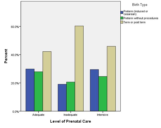
For example, suppose that we have data on the birth of twins. One categorical variable measures the level of prenatal care ("Adequate", "Inadequate" or "Intensive"), and the other one measures the outcome of the birth (called "Birth Type" in this data set, and classified by "Preterm (induced or cesarian)", "Preterm without procedures", or "Term or post term"). If we want to see if these two variables are associated, we can use a clustered bar graph. Since we would think of prenatal care as a predictor for birth type outcome, we choose to make prenatal care the grouping variable and birth type the response variable.
One can see that the outcomes for women who received adequate prenatal care and intensive prenatal care are about the same, but those who received inadequate prenatal care have a lower percentage of preterm births and a much higher percentage of term or post term births. (This may seem counterintuitive, but it's possible that it is precisely those women who are in more danger of preterm births who receive higher levels of prenatal care. Association is not evidence of causation, and the grouping variable is not chosen as such because it is believed to cause or directly influence the outcome.)
It's possible to put counts or percentages on the y-axis, but percentages usually make it easier to compare groups, especially if the groups are of different sizes. These are not "grand total" percentages, but rather are scaled so that each group adds up to 100%, equalizing the groups for comparative purposes.
Generating a clustered bar graph in SPSS
Go to the "Graphs" menu and select "Chart Builder".
In the Gallery, under "Bar", the second graph type is the clustered bar graph. Drag it to the preview window.
Drag the categorical grouping variable onto the X-Axis.
Drag the categorical response variable into the box in the corner called "Cluster on X: set color".
In the Element Properties window, under "Statistic" change "Count" to "Percentage".
Click the "Set Parameters" button right below that.
Change from "Grand Total" to "Total for Each X-Axis Category".
Click "Continue".
Click "Apply" in the Element Properties window.
Click "OK". The clustered bar graph will appear in the Output window.
Comments (0)
You don't have permission to comment on this page.