If you are citizen of an European Union member nation, you may not use this service unless you are at least 16 years old.
You already know Dokkio is an AI-powered assistant to organize & manage your digital files & messages. Very soon, Dokkio will support Outlook as well as One Drive. Check it out today!
A bar graph (or bar chart) displays the distribution of a categorical variable, showing the counts for each category next to each other for easy comparison. Bar graphs are useful because they help organize information and compare data. A bar graph contains an x-axis and a y-axis. The explanatory variable goes on the y-axis and the response variable goes on the x-axis. Each bar protrudes from the x-axis so that data is easily comparable. Ordering the bars is essential in generating a bar graph. Once it is created make sure the bar's orientation is from largest to smallest except when there is an "other" category, which goes last.
A bar graph compares a single categorical variable which is a group or category each individual belongs to. Examples of categorical variables are male or female, the state a person lives in, what a persons blood type is (A, B, AB, or O), etc.
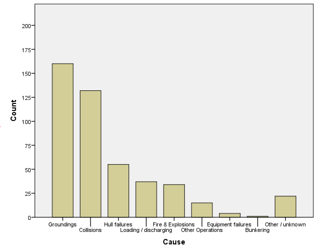
For Example, Data from the International Tanker Owners Pollution Federation Limited give the cause of spillage for 460 oil tanker accidents resulting in spills of more than 700 tons of oil from 1970-2010. (www.itopf.com/information-services/data-and-statistics/statistics)
Here is a visual representation of the data of the causes of oil spills for 1970-2010. You can see that the most common cause of oil spill is Groundings with 160 spills and the least cause is Bunkering with only 1 spill. The bar graph shows how many spills each cause has by how tall the bar is. This makes it easy for the user to tell which variable is the highest and lowest.
How to Generate a bar graph Using SPSS
Click on the "Graphs" menu at the top of the page then click on "Chart Builder".
When the pop up window appears, select the "Bar" in Gallery Tab.
select the first picture in the Bar options thats titled "Simple Bar" and drag it to the preview window.
In the variables box grab your single categorical variable and drag it to the box titled "X-Axis?"
The "Y-Axis?" box will automatically change to say "Count"
Click "OK" at the bottom of the screen and the graph will appear in the SPSS Output Window.
How to change the order of each bar in SPSS
Once the graph is displayed in the SPSS Output Window, double click the graph
A new window will show up titled "Chart Editor", Double click a single bar in the chart
Another new window will show up titled "Properties"
In the properties window click the categories tab on the top of the page
Where is says "Sort by:" click the box option next to it, A drop down menu will appear
Click the option that says "Statistic" after that click the box option after "Direction:"
A drop down menu will appear, click the option "Descending"
Then click "Apply" at the bottom of the window, the bars orientation should change from largest to smallest
*This next step only applies if you have an "Other" category in your categorical data*
In the "Order:" box click your "Other" category so that it is highlighted in yellow
Locate the up and down arrows to the right of the "Order:" box
While your "Other" is highlighted click the down arrow until the category is last in the list
The click the "Apply" button to apply your changes, your done with ordering
Close both the Chart Editor and Properties window
The video below shows the steps taken to creating a bar graph:
Comments (0)
You don't have permission to comment on this page.