A side-by-side boxplots is very similar to a boxplot, but there is more than one dataset. They display the visual distributions of categorical data by comparing them on a quantitative scale. Comparing distributions with a side-by-side boxplot is important to better understand the data. The example below compares three Major League Baseball players and their homerun distances in feet in a given season.
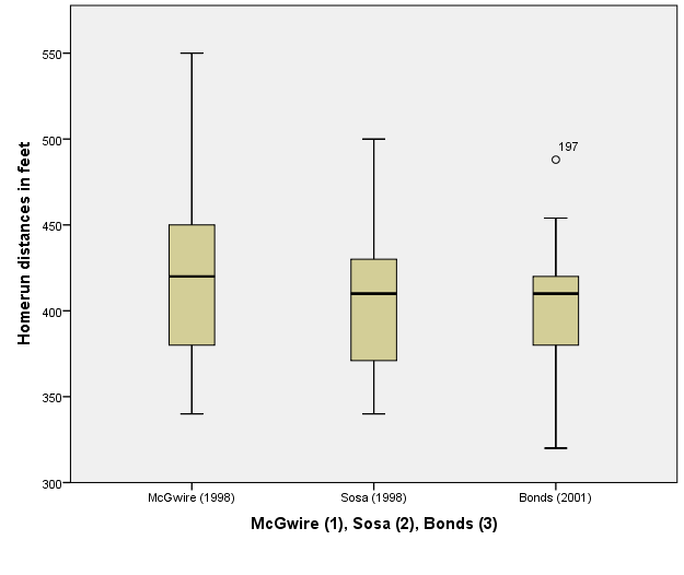
By looking at the data, we can see that each baseball players homerun median distance is about the same, while their minimum, maximum, as well as the quartiles have various values. The player named Barry Bonds has an outlier at about 475 feet. It is denoted by the number 197 because it is data number 197 in SPSS. We can also say that Mark McGwire, represented by the number 1, has the largest range and the furthest homerun distance in feet.
Generating a side-by-side boxplot in SPSS
· Go to “Chart Builder” under the “Graphs” menu
· In the Gallery under “Boxplots” choose the “Simple Boxplot”, which is the first option. Drag it to the preview window.
· Drag the categorical grouping variable onto the X-axis
· Drag the quantitative response variable onto the Y-axis
· Click “OK” at the bottom and the side-by-side boxplot will appear in the output window
To edit the side-by-side boxplot to better display the data by changing the range of values on the y-axis:
· Double click the side-by-side boxplot to edit it
· Double click a value on the Y-axis
· Choose the scale tab in the new window
· Edit the given minimum value to a number closer to the data's minimum value
· Click “Apply”, then click “Close”
· Exit out of the Chart Editor
· The output window displays the side-by-side boxplot better without the additional area inside the graph
The following video shows how to illustrate these steps: